Simulating Amplitude Modulation using Python
Oct 1, 2019
In communication labs in our colleges we all generate amplitude modulated signals using CROs. But the same can be performed by using Python and few of its additional libraries and the end result can be equally dope. At first let’s revise the formulas needed to generate amplitude modulated signal.
Message Signal
Carrier Signal
Amplitude Modulated Signal
Now to simulate the signals in python first we have to import 2 python libraries: numpy and matplotlib
import numpy as np
import matplotlib.pyplot as plt
Then we have to take carrier amplitude, carrier frequency, message amplitude, message frequency and modulation index as inputs.
A_c = float(input('Enter carrier amplitude: '))
f_c = float(input('Enter carrier frquency: '))
A_m = float(input('Enter message amplitude: '))
f_m = float(input('Enter message frquency: '))
modulation_index = float(input('Enter modulation index: ')
The built-in input function in python returns string value. So we have to convert then to integer or float. Now float is preferred because amplitude or frequencies can be in decimal too. The time function in analog communication is continuous function. To replicate its behavior we will use linspace function which will provide large number of discreet points which will act almost similar to continuous function. The linspace function will generate evenly spaced number within a given interval. The first argument of linspace is starting point, second argument is ending point and third argument is number of breakpoints between the given interval.
t = np.linspace(0, 1, 1000)
Now we will create our carrier, modulator(message), and product function. Here we will use sin , cos and pi from numpy.
carrier = A_c*np.cos(2*np.pi*f_c*t)
modulator = A_m*np.cos(2*np.pi*f_m*t)
product = A_c*(1+modulation_index*np.cos(2*np.pi*f_m*t))*np.cos(2*np.pi*f_c*t)
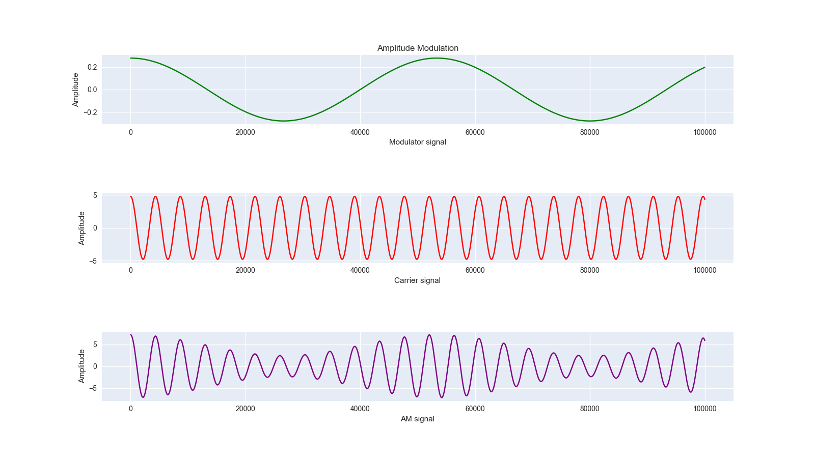
Here comes the plotting part. We will utilize matplotlib library functions. The subplot function creates more than one plot in the canvas. The plot function plots the given function. In plot function we can pass color names or their acronyms to plot the graph in any color we wish. The ‘g’ , ‘r’ stands for green and red respectively. The xlabel and ylabel prints the x-axis and y-axis variable names. And the title function prints the title of the over all plot.
plt.subplot(3,1,1)
plt.title('Amplitude Modulation')
plt.plot(modulator,'g')
plt.ylabel('Amplitude')
plt.xlabel('Message signal')

plt.subplot(3,1,2)
plt.plot(carrier, 'r')
plt.ylabel('Amplitude')
plt.xlabel('Carrier signal')

plt.subplot(3,1,3)
plt.plot(product, color="purple")
plt.ylabel('Amplitude')
plt.xlabel('AM signal')
Now we can customize the plot as much we want. We can change the space between plots, font, size etc. And if we want to save the picture we can easily do so by savefig function where dpi means dots per inch which in today’s world, can be inter-changeably used with ppi(pixel per inch).
plt.subplots_adjust(hspace=1)
plt.rc('font', size=15)
fig = plt.gcf()
fig.set_size_inches(16, 9)

fig.savefig('Amplitude Modulation.png', dpi=100)
Thus we can create simple amplitude modulation plot in python just using two external libraries only. The article has been published in Medium Simulating Amplitude Modulation using Python